Atomic Vodka Branding

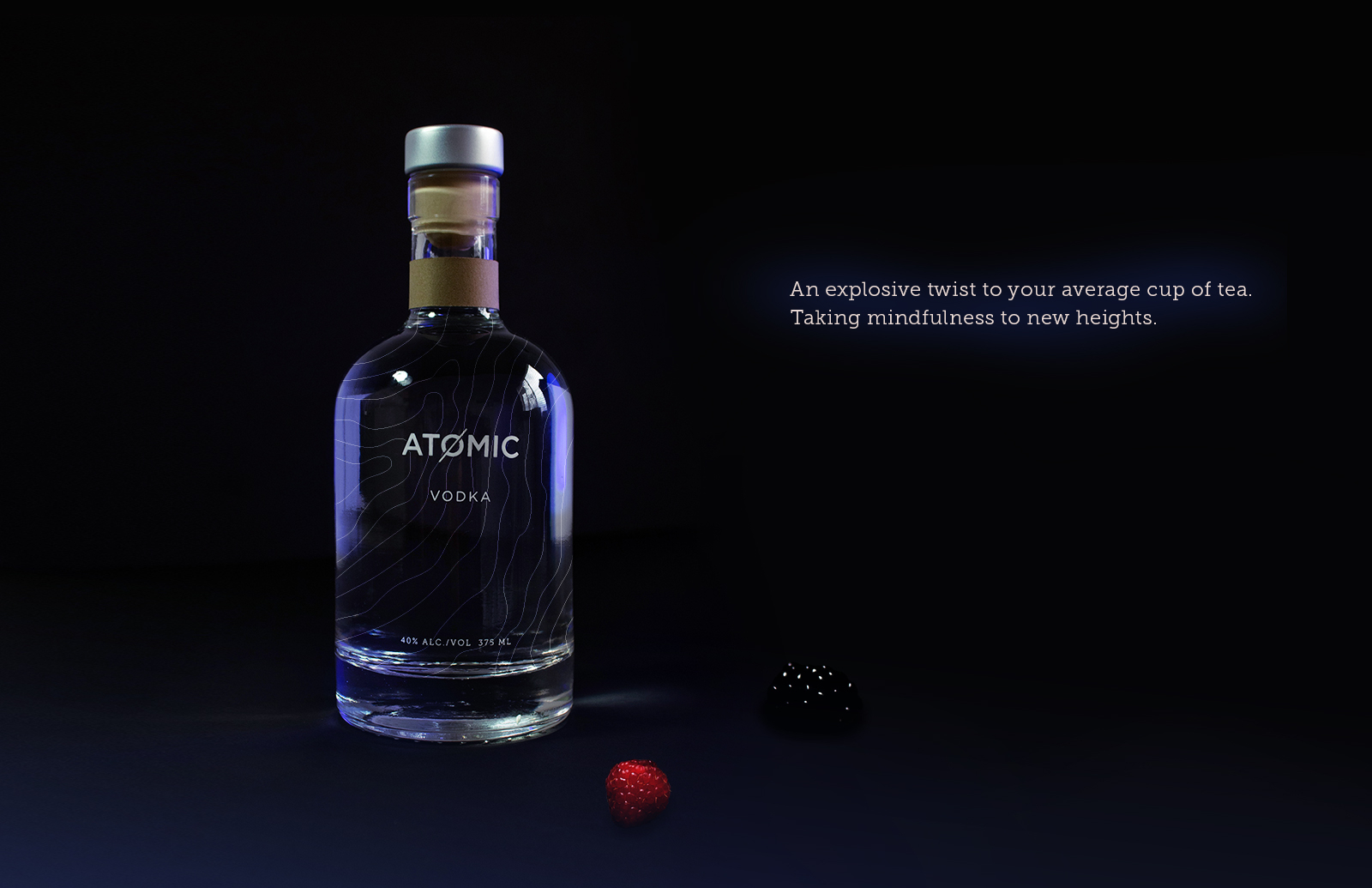
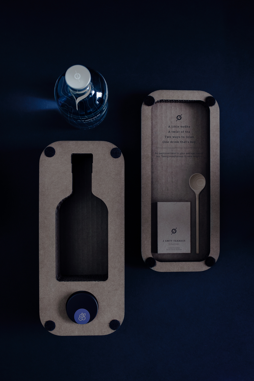
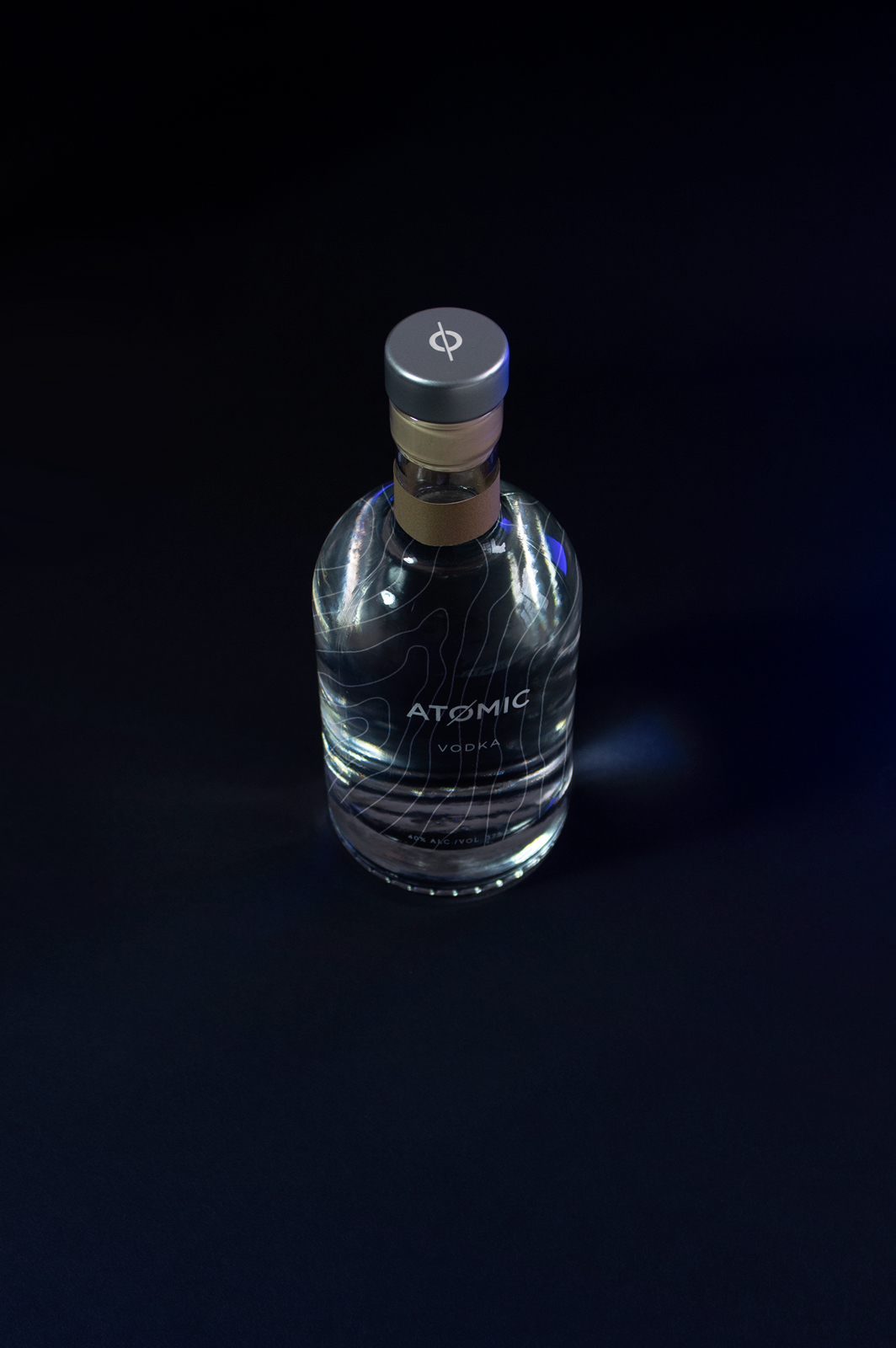
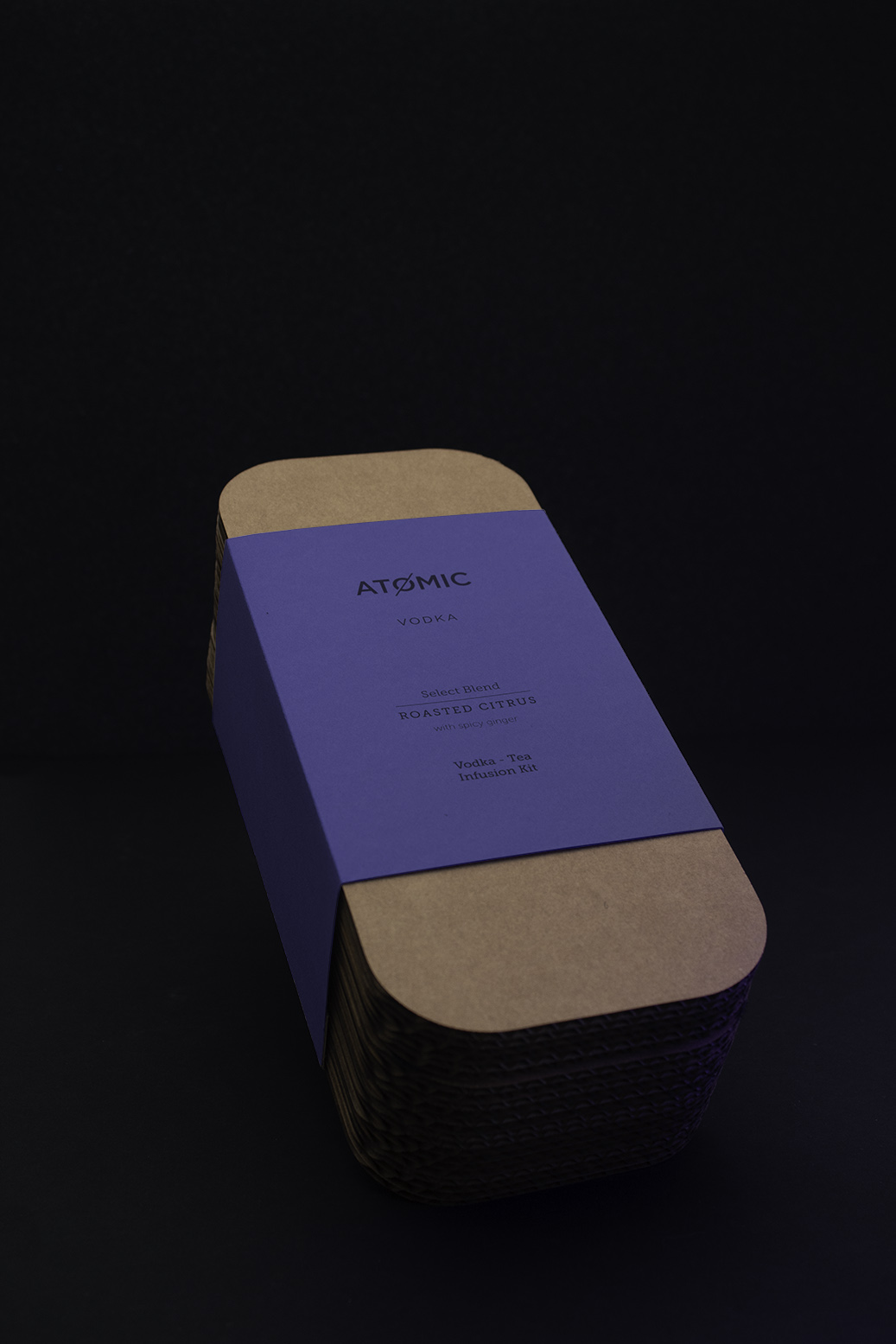
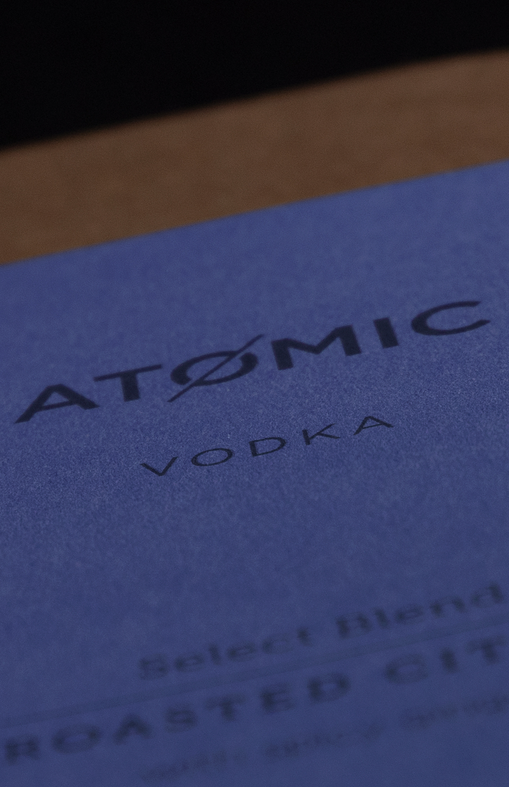
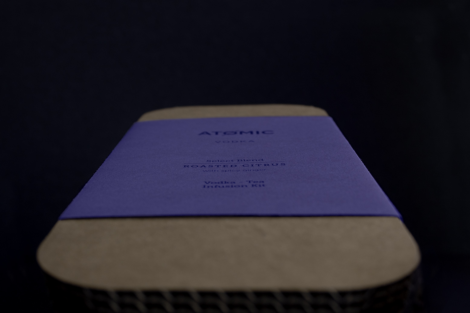
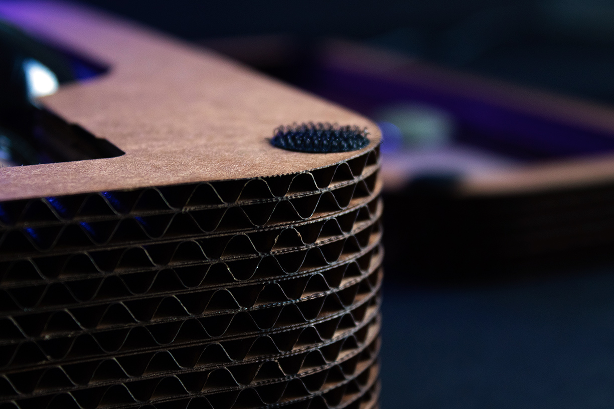
Atomic is a vodka brand named after the small town of "Atomic City" in Idaho, where the vodka’s base ingredient, Idaho potatoes, are sourced. The brand was created to deliver a premium vodka experience to a broader audience, challenging the idea that quality and aesthetics need to be expensive. It is designed to be marketed as a vodka-tea infusion kit presented in unique packaging with a personal-sized vodka bottle and other components.

Full Case Study
SCENARIO

Create and apply an identity for a client that manufactures alcoholic beverages. The client wants a vodka brand as well as a line that can be marketed in the stores.

RESEARCH

I conducted this case study based on the Psyco-Aesthetics(P/A) concept, an advanced design-thinking methodology that aims to understand the factors that determine aesthetic experience.

1. Benchmarking

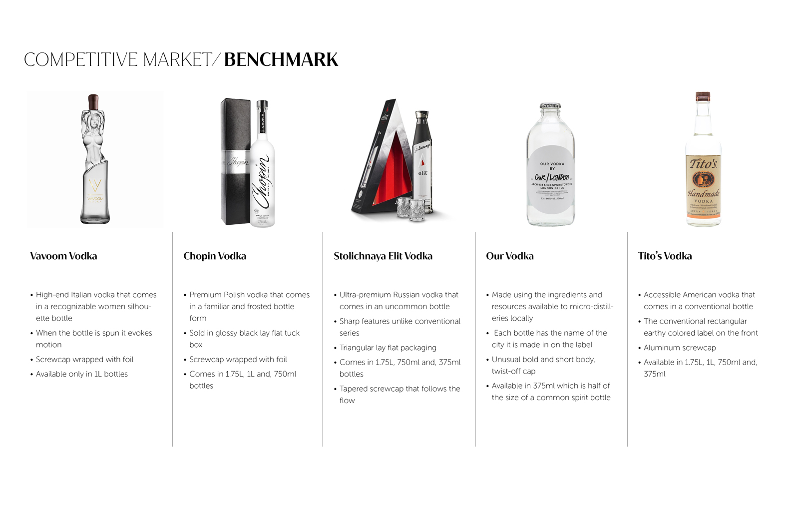
The research process started with competitive market research. I found five top competitors and made a breakdown of their attributes as well as common descriptors and positive and negatives sides of each product.

2. Consumer Research

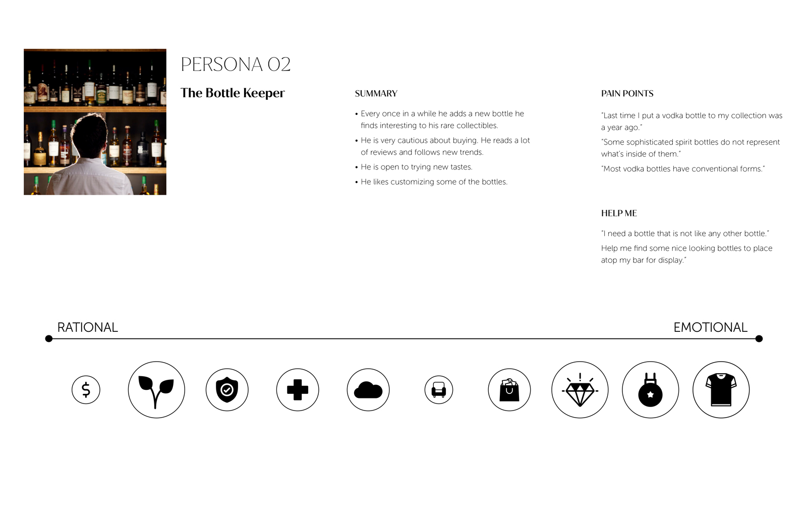
The following process was conducting consumer research. The goal was to survey vodka consumers and create four personas to find their needs and aspirations.

3. Opportunity Zone

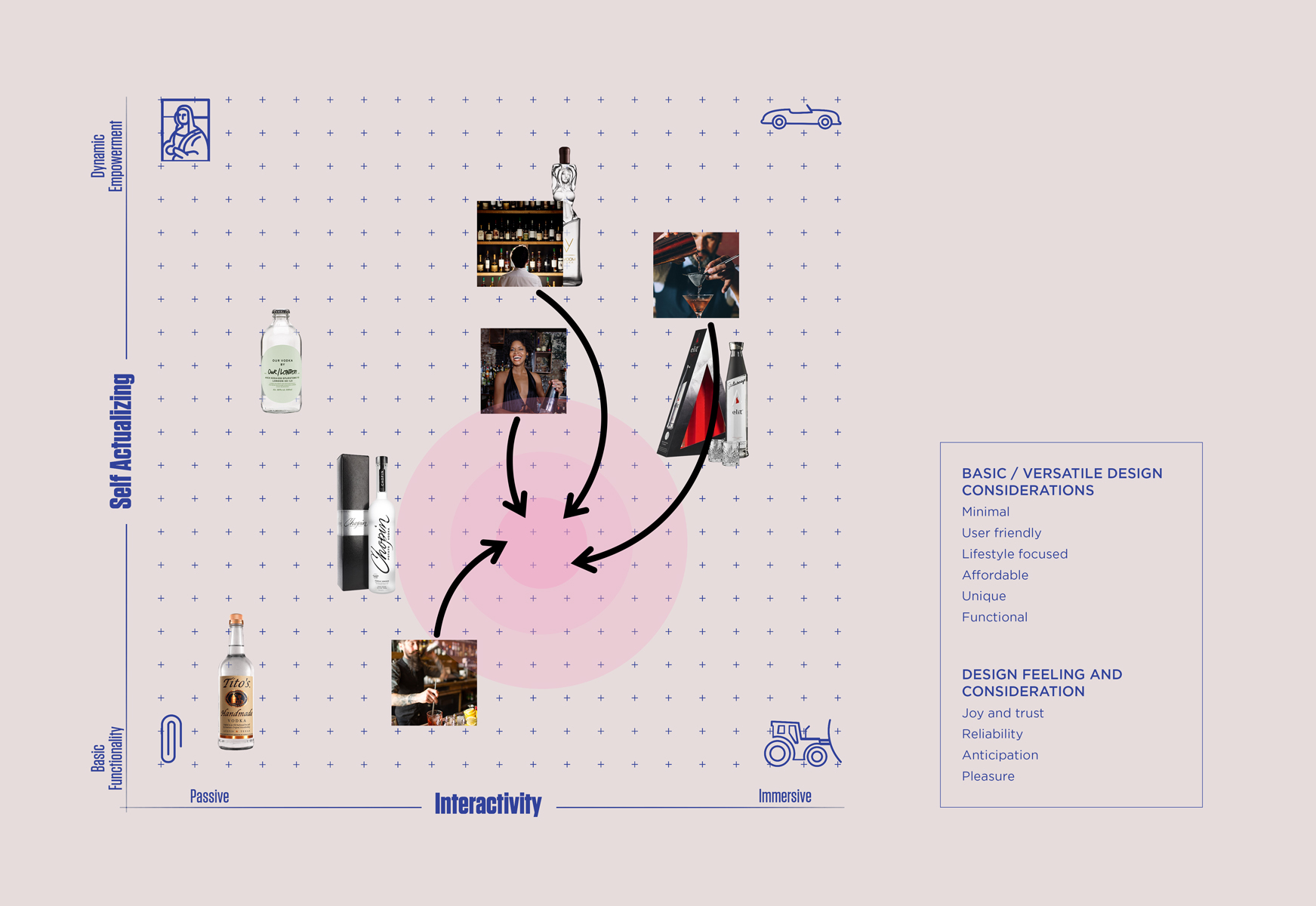
Based on the consumer and competitive market research, I found that the current industry has gaps in the basic/versatile design opportunity zone. This design consideration is to be defined with the key attractors such as minimal, user-friendly, affordable, lifestyle-focused, and functional.

IDEATION AND DESIGN

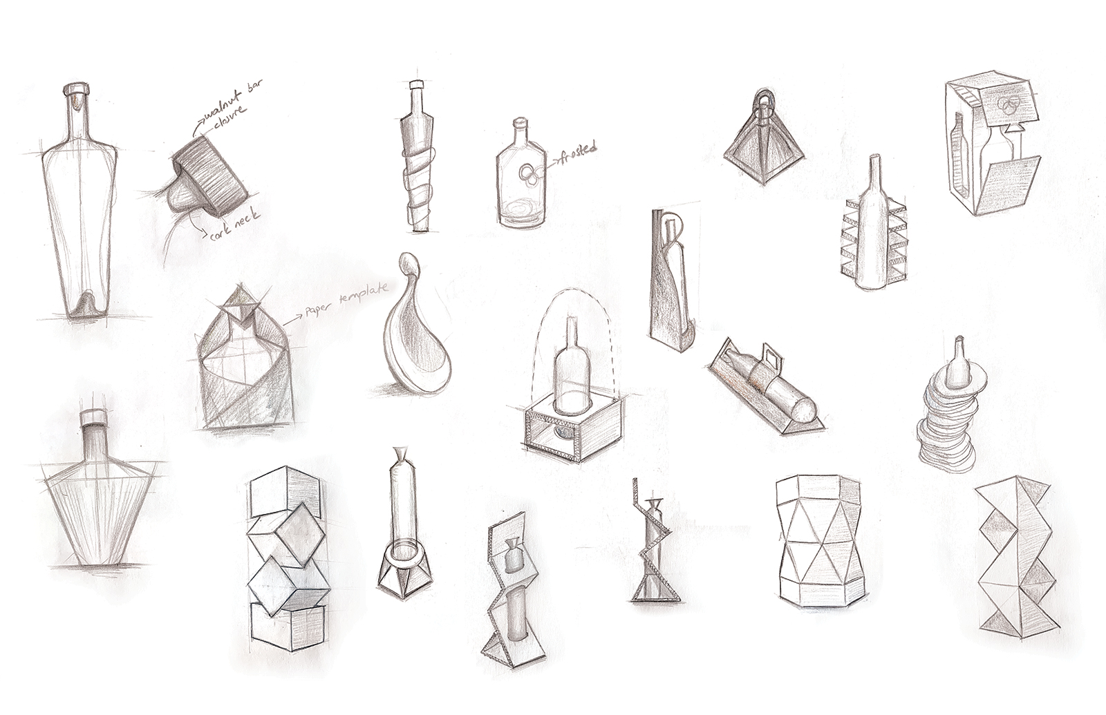
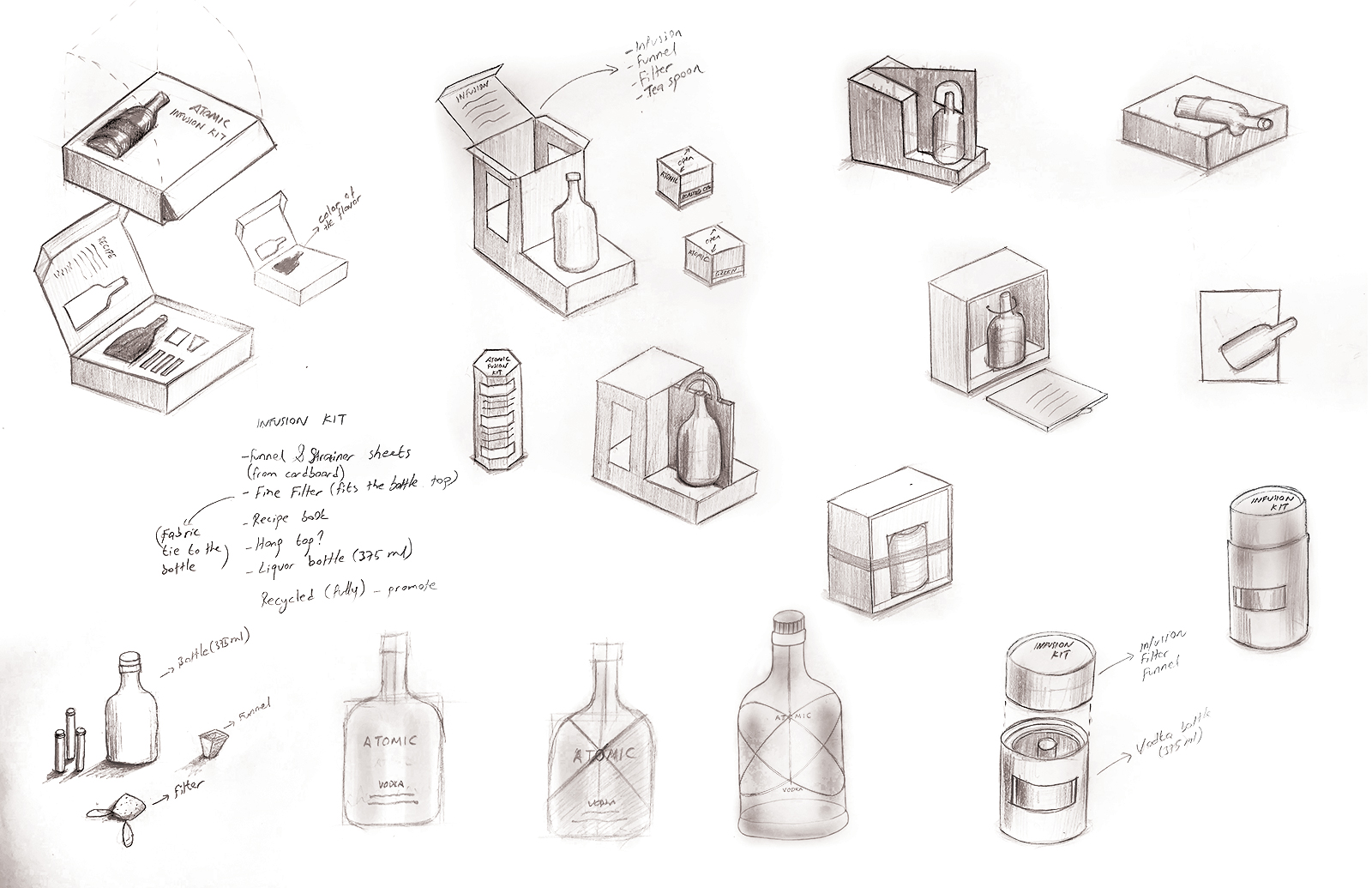
Using the collective P/A insights, I came up with some design ideas.

BRAND IDENTITY
THE VODKA/TEA KIT
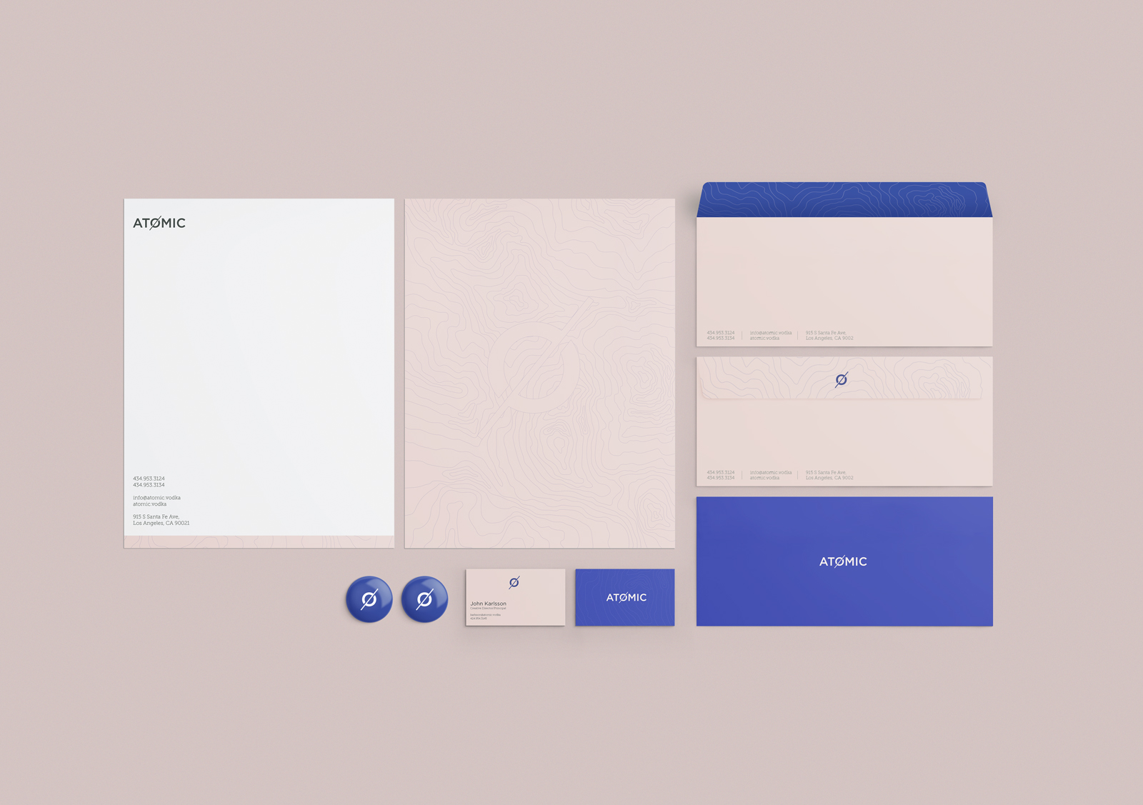
STATIONARY